Appearance
Flutter教程 - 4 组件
4.16 卡片组件 Card
Card 是一个常用的用于创建卡片式 UI 元素的组件。它提供了一种简单的方式来呈现带有阴影和圆角的矩形区域,通常用于展示一些相关的信息、内容或操作。它可以使信息的展示更有立体感。
举个栗子:
先看效果:
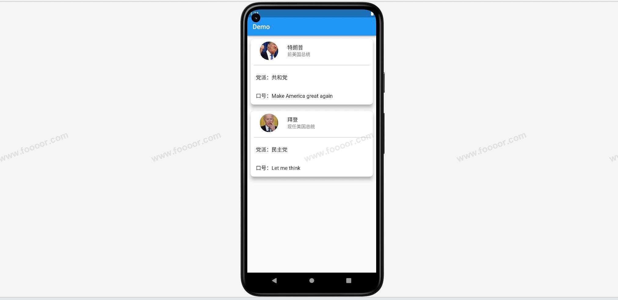
是不是很有效果。
看一下代码:
dart
import 'package:flutter/material.dart';

void main() => runApp(const MyApp());

/// App根Widget
class MyApp extends StatelessWidget {
  const MyApp({super.key});

  @override
  Widget build(BuildContext context) {
    return const MaterialApp(
      debugShowCheckedModeBanner: false,
      home: DemoPage(),
    );
  }
}

/// 页面
class DemoPage extends StatelessWidget {
  const DemoPage({super.key});

  @override
  Widget build(BuildContext context) {
    return Scaffold(
        appBar: AppBar(
          title: const Text('Demo'),
        ),
        // ------------------这里是在ListView中添加的Card组件----------------------
        body: ListView(
          children: [
            // ------------------第一个Card------------------
            Card(
              margin: const EdgeInsets.all(10),         // 设置卡片外边距
              elevation: 10,                            // 设置卡片的阴影
              shadowColor: Colors.grey,                 // 设置阴影的颜色,有默认值,可以不设置
              shape: const RoundedRectangleBorder(      // 设置卡片的圆角,想调整圆角弧度,可以设置
                  borderRadius: BorderRadius.all(Radius.circular(10))
              ),
              // ------------------在Card中添加子组件,这里使用了一个列排序------------------
              child: Column(
                children: [
                  const ListTile(
                    leading: CircleAvatar(
                      radius: 40, // 设置圆形图片的半径
                      backgroundImage: NetworkImage(
                          "http://doubibiji.com/open-assets/img/telangpu.jpg" // 网络图片的地址
                          ),
                    ),
                    title: Text("特朗普"),
                    subtitle: Text("前美国总统"),
                  ),
                  Divider(color: Colors.grey.shade400, indent: 10, endIndent: 10, thickness: 1),
                  const ListTile(
                    title: Text("党派:共和党", style: TextStyle(fontSize: 16),),
                  ),
                  const ListTile(
                    title: Text("口号:Make America great again"),
                  )
                ],
              ),
            ),
            // ------------------第二个Card------------------
            Card(
              margin: const EdgeInsets.all(10),       // 设置卡片外边距
              elevation: 10,                          // 设置卡片的阴影
              shadowColor: Colors.grey,               // 设置阴影的颜色,有默认值,可以不设置
              shape: const RoundedRectangleBorder(    // 设置卡片的圆角,想调整圆角弧度,可以设置
                  borderRadius: BorderRadius.all(Radius.circular(10))
              ),
              child: Column(
                children: [
                  const ListTile(
                    leading: CircleAvatar(
                      radius: 40, // 设置圆形图片的半径
                      backgroundImage: NetworkImage(
                          "http://doubibiji.com/open-assets/img/baideng.jpg" // 网络图片的地址
                      ),
                    ),
                    title: Text("拜登"),
                    subtitle: Text("现任美国总统"),
                  ),
                  Divider(color: Colors.grey.shade400, indent: 10, endIndent: 10, thickness: 1),
                  const ListTile(
                    title: Text("党派:民主党", style: TextStyle(fontSize: 16),),
                  ),
                  const ListTile(
                    title: Text("口号:Let me think"),
                  )
                ],
              ),
            ),
          ],
        ));
  }
}
上面的代码是在 ListView 中添加了两个Card ,在实际的开发中,可以根据数据生成多个 Card 。
Card 的组件的使用也是很简单的,只需要设置指定的属性即可,然后在 Card 中添加子组件,上面是添加了 Column 组件,用于信息的布局。
再看一个例子:
当在Card中设置了一个图片组件时:
dart
Card(
  margin: const EdgeInsets.all(10),         // 设置卡片外边距
  elevation: 10,                            // 设置卡片的阴影
  shadowColor: Colors.grey,                 // 设置阴影的颜色,有默认值,可以不设置
  shape: const RoundedRectangleBorder(      // 设置卡片的圆角,想调整圆角弧度,可以设置
      borderRadius: BorderRadius.all(Radius.circular(30))),
  child: Column(
    children: [
      Image.network(
          height: 300,
          width: double.infinity,
          "http://doubibiji.com/open-assets/img/telangpu.jpg",
          fit: BoxFit.cover),
      const Text("8月1日,由于特朗普被指控颠覆了2020年的选举,特朗普被提起了第三项刑事诉讼。这是一个非常严重的罪名,并且将国会暴乱的责任推到了特朗普身上。")
    ],
  ),
)
显示效果:
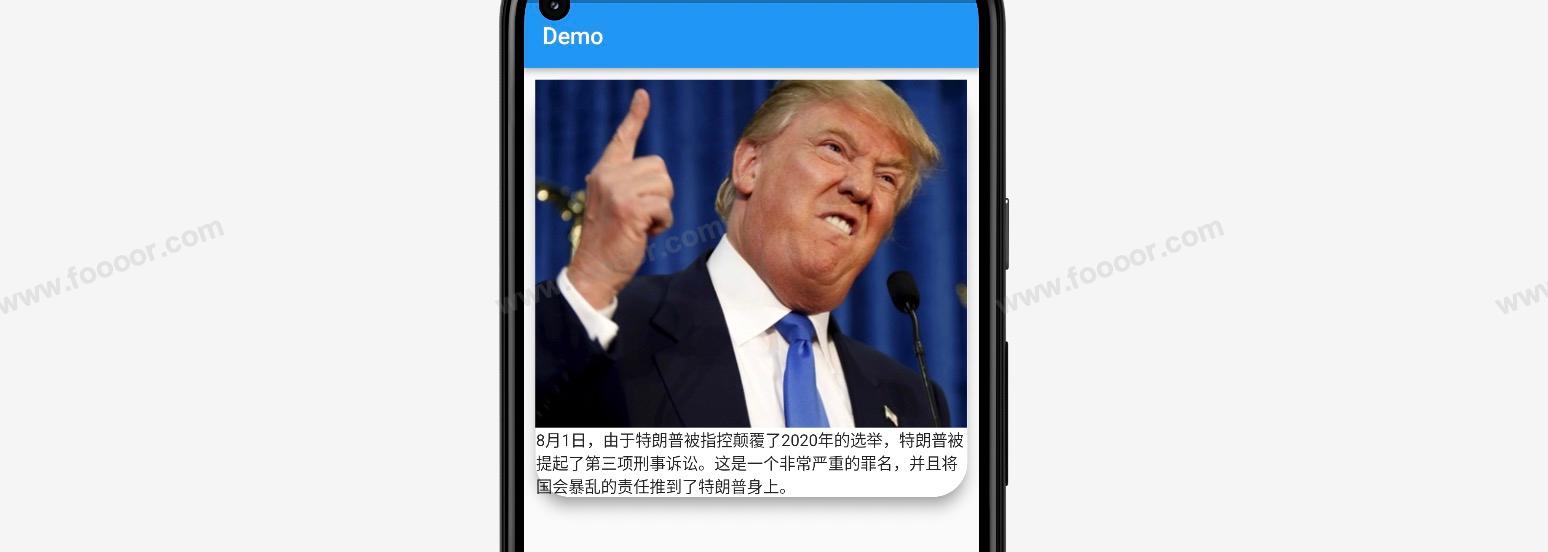
会发现上面的圆角没有起作用,下面的文字也从卡片溢出了。
这个时候,可以通过 clipBehavior 属性设置内容溢出后的剪切方式。
dart
Card(
    margin: const EdgeInsets.all(10),
    elevation: 10,
    shadowColor: Colors.grey,
    shape: const RoundedRectangleBorder(
        borderRadius: BorderRadius.all(Radius.circular(30))
    ),
    clipBehavior: Clip.antiAliasWithSaveLayer,    // 设置内容溢出后的裁剪方式
    child: Column(
      children: [
        Image.network(
            height: 300,
            width: double.infinity,
            "http://doubibiji.com/open-assets/img/telangpu.jpg",
            fit: BoxFit.cover),
        const Text("8月1日,由于特朗普被指控颠覆了2020年的选举,特朗普被提起了第三项刑事诉讼。这是一个非常严重的罪名,并且将国会暴乱的责任推到了特朗普身上。")
      ],
    ),
)
显示效果:
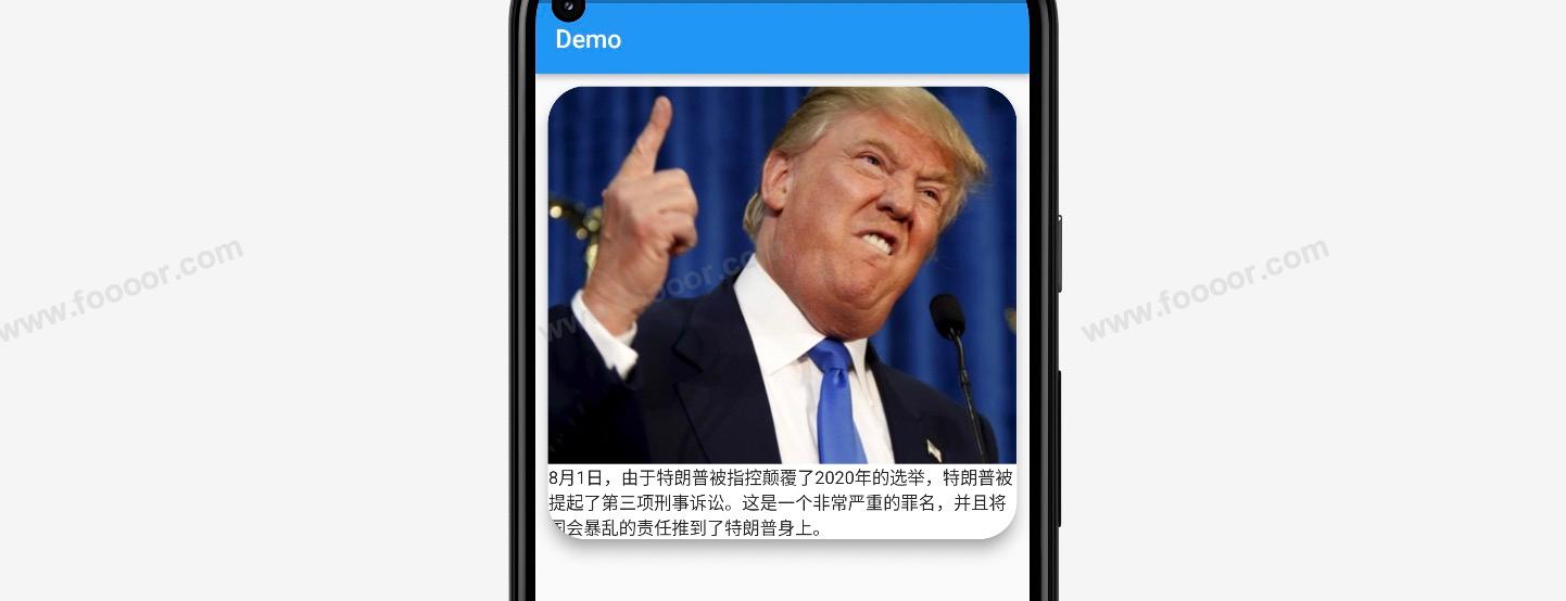
好多了。
再总结一下 Card 的属性:
| 属性 | 说明 |
|---|---|
| child | 子组件 |
| margin | 外边距 |
| elevation | 设置阴影值的深度 |
| shadowColor | 阴影的颜色,默认是灰色 |
| color | color |
| clipBehavior | 内容溢出的剪切方式。 Clip.none不剪切; Clip.hardEdge裁剪是硬边缘,会有锯齿 Clip.antiAlias裁剪边缘使用反锯齿效果,使得裁剪边界更加平滑。 Clip.antiAliasWithSaveLayer类似于 Clip.antiAlias,但是在对子组件进行裁剪之前会创建一个中间图层,这可以帮助减少不必要的图形绘制。这个模式的性能可能会稍微好一些。 |
| shape | 设置卡片的圆角。 shape: const RoundedRectangleBorder(borderRadius: BorderRadius.all(Radius.circular(10))), |
4.17 按钮组件
Flutter 中提供了很多内置的按钮组件,我们可以直接拿来使用就可以了,并可以根据自己的需要进行设置。
1 四种按钮
Flutter 中主要有四种:凸起按钮、文字按钮、边框按钮、图标按钮
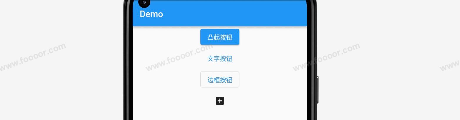
实现代码如下:
dart
import 'package:flutter/material.dart';

void main() => runApp(const MyApp());

/// App根Widget
class MyApp extends StatelessWidget {
  const MyApp({super.key});

  @override
  Widget build(BuildContext context) {
    return const MaterialApp(
      debugShowCheckedModeBanner: false,
      home: DemoPage(),
    );
  }
}

/// 页面
class DemoPage extends StatelessWidget {
  const DemoPage({super.key});

  @override
  Widget build(BuildContext context) {
    return Scaffold(
      appBar: AppBar(
        title: const Text('Demo'),
      ),
      // ------------------Card------------------
      body: Align(
          alignment: Alignment.center,
          child: Column(
            children: [
              // ---------------凸起按钮-------------------
              ElevatedButton(onPressed: () {}, child: const Text("凸起按钮")),

              // ---------------文字按钮-------------------
              TextButton(onPressed: () {}, child: const Text("文字按钮")),

              // ---------------边框按钮-------------------
              OutlinedButton(onPressed: () {}, child: const Text("边框按钮")),

              // ---------------图标按钮-------------------
              IconButton(onPressed: () {}, icon: const Icon(Icons.add_box))
            ],
          )),
    );
  }
}
按钮都会带有一个 onPressed 回调函数,当点击按钮的时候会触发。如果不设置 onPressed 属性,按钮将是灰色的。
2 添加图标
除了图标按钮可以是图标,凸起按钮、文字按钮、边框按钮都可以添加图标,并设置图标的颜色。
效果如下:
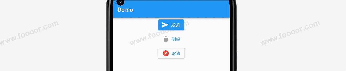
实现代码如下:
dart
// ---------------凸起按钮-------------------
ElevatedButton.icon(
    onPressed: () {},
    icon: const Icon(Icons.send, color: Colors.white),
    label: const Text("发送")
),

// ---------------文字按钮-------------------
TextButton.icon(
    onPressed: () {},
    icon: const Icon(Icons.delete, color: Colors.grey),
    label: const Text("删除")
),

// ---------------边框按钮-------------------
OutlinedButton.icon(
    onPressed: () {},
    icon: const Icon(Icons.cancel, color: Colors.red),
    label: const Text("取消")
)
3 修改颜色文字大小
除了添加图标,上面的几种按钮,还可以修改样式,达到不同的效果。
例如修改颜色、字体大小等。
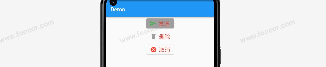
实现代码如下:
dart
// ---------------凸起按钮-------------------
ElevatedButton.icon(
  onPressed: () {},
  icon: const Icon(Icons.send, color: Colors.green),
  label: const Text("发送", style: TextStyle(color: Colors.red, fontSize: 20)),    // 修改按钮字体颜色和大小
  style: ButtonStyle(
    backgroundColor: MaterialStateProperty.all(Colors.grey),  // 修改按钮背景颜色
    foregroundColor: MaterialStateProperty.all(Colors.black), // 修改文字颜色,会被字体颜色覆盖
  ),
),

// ---------------文字按钮-------------------
TextButton.icon(
    onPressed: () {},
    icon: const Icon(Icons.delete, color: Colors.grey),
    label: const Text("删除", style: TextStyle(color: Colors.red, fontSize: 20)) // 修改按钮字体颜色和大小
),

// ---------------边框按钮-------------------
OutlinedButton.icon(
    onPressed: () {},
    icon: const Icon(Icons.cancel, color: Colors.red),
    label: const Text("取消", style: TextStyle(color: Colors.red, fontSize: 20)) // 修改按钮字体颜色和大小
),
4 固定尺寸按钮大小
按钮中是没有属性修改大小的,如果想要修改按钮的大小,可以使用 Container 或 Sizedbox 包裹按钮,并设置 Container 或 Sizedbox 的大小,这样按钮会自适应外围容器的大小。
举个栗子:
实现代码如下:
dart
import 'package:flutter/material.dart';

void main() => runApp(const MyApp());

/// App根Widget
class MyApp extends StatelessWidget {
  const MyApp({super.key});

  @override
  Widget build(BuildContext context) {
    return const MaterialApp(
      debugShowCheckedModeBanner: false,
      home: DemoPage(),
    );
  }
}

/// 页面
class DemoPage extends StatelessWidget {
  const DemoPage({super.key});

  @override
  Widget build(BuildContext context) {
    return Scaffold(
      appBar: AppBar(
        title: const Text('Demo'),
      ),
      // ------------------Card------------------
      body: Align(
          alignment: Alignment.center,
          child: Column(
            children: [
              const SizedBox(height: 10),

              SizedBox(
                width: 300,         // 可以修改按钮的大小
                height: 60,
                // ---------------凸起按钮-------------------
                child: ElevatedButton(
                  onPressed: () {},
                  child: const Text("发送"),
                ),
              ),

              const SizedBox(height: 10),

              SizedBox(
                width: 300,        // 可以修改按钮的大小
                height: 60,
                // ---------------文字按钮-------------------
                child: TextButton(
                    onPressed: () {},
                    child: const Text("删除")
                ),
              ),

              const SizedBox(height: 10),

              SizedBox(
                  width: 300,       // 可以修改按钮的大小
                  height: 60,
                  // ---------------边框按钮-------------------
                  child: OutlinedButton(
                      onPressed: () {},
                      child: const Text("取消")
                  )
              ),
            ],
          )),
    );
  }
}
5 自适应尺寸按钮大小
例如想设置一个宽度跟随屏幕宽度自适应的按钮。
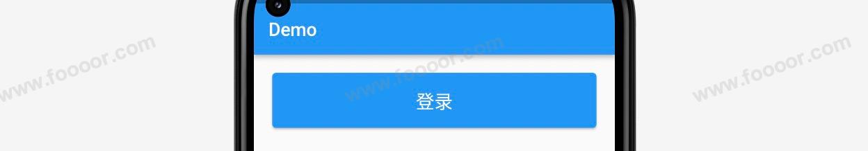
我们可以使用 Expanded 组件来实现。
代码如下:
dart
import 'package:flutter/material.dart';
void main() => runApp(const MyApp());
/// App根Widget
class MyApp extends StatelessWidget {
const MyApp({super.key});
@override
Widget build(BuildContext context) {
return const MaterialApp(
debugShowCheckedModeBanner: false,
home: DemoPage(),
);
}
}
/// 页面
class DemoPage extends StatelessWidget {
const DemoPage({super.key});
@override
Widget build(BuildContext context) {
return Scaffold(
appBar: AppBar(
title: const Text('Demo'),
),
// ------------------Card------------------
body: Align(
alignment: Alignment.topCenter,
child: Row(
children: [
// ---------------设置自适应尺寸按钮-------------------
Expanded(
child: Container(
height: 60,
margin: const EdgeInsets.all(20),
// ---------------凸起按钮-------------------
child: ElevatedButton(
onPressed: () {},
child: const Text("登录", style: TextStyle(fontSize: 20)), // 修改按钮字体颜色和大小
),
)),
],
)),
);
}
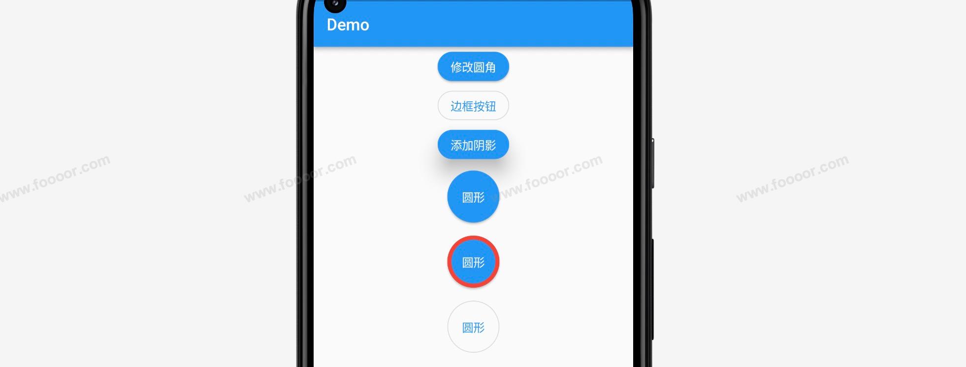
}6 圆角和圆形按钮
通过 style 中的 shape 属性,可以设置按钮的圆角,虽然默认的按钮有一些圆角效果,我们还可以修改圆角效果,并通过圆角效果设置圆形的按钮。
代码如下:
dart
import 'package:flutter/material.dart';

void main() => runApp(const MyApp());

/// App根Widget
class MyApp extends StatelessWidget {
  const MyApp({super.key});

  @override
  Widget build(BuildContext context) {
    return const MaterialApp(
      debugShowCheckedModeBanner: false,
      home: DemoPage(),
    );
  }
}

/// 页面
class DemoPage extends StatelessWidget {
  const DemoPage({super.key});

  @override
  Widget build(BuildContext context) {
    return Scaffold(
      appBar: AppBar(
        title: const Text('Demo'),
      ),
      // ------------------Card------------------
      body: Align(
          alignment: Alignment.center,
          child: Column(
            children: [
              // ---------------修改圆角-------------------
              ElevatedButton(
                onPressed: () {},
                style: ButtonStyle(
                  shape: MaterialStateProperty.all(
                    RoundedRectangleBorder(							// 设置圆角
                      borderRadius: BorderRadius.circular(30)
                    )),
                ),
                child: const Text("修改圆角"),
              ),

              // ---------------边框按钮-------------------
              OutlinedButton(onPressed: () {},
                  style: ButtonStyle(
                    shape: MaterialStateProperty.all(
                      RoundedRectangleBorder(						// 设置圆角
                        borderRadius: BorderRadius.circular(30)
                      )),
                  ),
                  child: const Text("边框按钮")),

              // ---------------添加阴影-------------------
              ElevatedButton(
                onPressed: () {},
                style: ButtonStyle(
                  elevation: MaterialStateProperty.all(20),			// 添加阴影
                  shape: MaterialStateProperty.all(
                    RoundedRectangleBorder(
                      borderRadius: BorderRadius.circular(30)
                    )),
                ),
                child: const Text("添加阴影"),
              ),


              // ---------------圆形无边框按钮-------------------
              SizedBox(                 // 为了调整按钮大小
                height: 80,
                child: ElevatedButton(
                  onPressed: () {},
                  style: ButtonStyle(
                    shape: MaterialStateProperty.all(
                      const CircleBorder(								// 设置为原型按钮
                        side: BorderSide(
                          color: Color(0x00000000)			// 按钮默认是有边框的,这里设置为透明边框
                        )
                      )),
                  ),
                  child: const Text("圆形"),
                ),
              ),

              // ---------------圆形带边框-------------------
              SizedBox(               // 为了调整按钮大小
                height: 80,
                child: ElevatedButton(
                  onPressed: () {},
                  style: ButtonStyle(
                    shape: MaterialStateProperty.all(
                      const CircleBorder(
                        side: BorderSide(
                          width: 5, 										// 设置边框的宽度
                          color: Colors.red							// 设置边框的颜色
                        )
                      )),
                  ),
                  child: const Text("圆形"),
                ),
              ),

              // ---------------圆形边框按钮-------------------
              SizedBox(               // 为了调整按钮大小
                height: 80,
                child: OutlinedButton(onPressed: () {},
                    style: ButtonStyle(
                      shape: MaterialStateProperty.all(
                        const CircleBorder(
                          side: BorderSide()					// 在这里面设置边框的宽度和颜色是无效的
                        )),
                    ),
                    child: const Text("圆形")),
              ),

            ],
          )),
    );
  }
}
设置圆形按钮的时候,默认是有边框的,如果要设置无边框的,可以将边框设置为透明的颜色。
对于边框按钮,通过 BorderSide 中的属性来设置边框的宽度和颜色是无效的。
7 修改边框按钮的边框
下面颜色一下修改边框按钮的边框宽度和颜色。
效果如下:
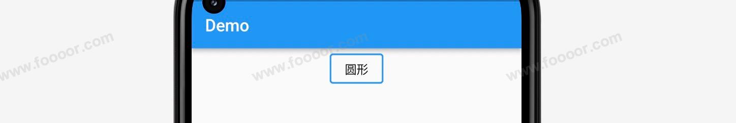
代码如下:
dart
OutlinedButton(
    onPressed: () {},
    style: ButtonStyle(
      foregroundColor: MaterialStateProperty.all(Colors.black),   // 修改文字的颜色
      side: MaterialStateProperty.all(
          const BorderSide(width: 2, color: Colors.blue)),        // 修改边框宽度和颜色
    ),
    child: const Text("圆形")
)
4.18 容器组件Wrap
Wrap 是一个用于流式布局的组件,它可以将一系列子组件在水平或垂直方向上自动换行排列,适用于需要根据可用空间动态调整布局的情况。Wrap 可以在超出容器边界时自动将子组件放置到下一行或下一列,以适应不同尺寸的屏幕或容器。
我们之前学习了 Row 和 Column 组件,但是 Row 组件中的元素装不下不会换到下一行,但是 Wrap 组件可以。
举个栗子:
在下面的样例中,我们在Wrap 组件中添加了很多的边框按钮,按钮从上到下一行一行排列,当一行排不下时,会换一行继续排列。
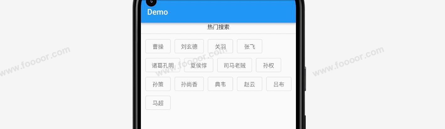
实现代码:
dart
import 'package:flutter/material.dart';

void main() => runApp(const MyApp());

/// App根Widget
class MyApp extends StatelessWidget {
  const MyApp({super.key});

  @override
  Widget build(BuildContext context) {
    return const MaterialApp(
      debugShowCheckedModeBanner: false,
      home: DemoPage(),
    );
  }
}

/// 页面
class DemoPage extends StatelessWidget {
  const DemoPage({super.key});

  @override
  Widget build(BuildContext context) {
    return Scaffold(
      appBar: AppBar(
        title: const Text('Demo'),
      ),
      body: Column(crossAxisAlignment: CrossAxisAlignment.center, children: [
        const Text("热门搜索"),
        const Divider(color: Colors.grey),
        // --------------- Wrap的使用 -------------------
        Wrap(
          spacing: 10,        // 子组件之间的间距
          runSpacing: 0,      // 行之间的间距
          children: [
            OutlinedButton(onPressed: () {}, child: const Text("曹操", style: TextStyle(color: Colors.black54))),
            OutlinedButton(onPressed: () {}, child: const Text("刘玄德", style: TextStyle(color: Colors.black54))),
            OutlinedButton(onPressed: () {}, child: const Text("关羽", style: TextStyle(color: Colors.black54))),
            OutlinedButton(onPressed: () {}, child: const Text("张飞", style: TextStyle(color: Colors.black54))),
            OutlinedButton(onPressed: () {}, child: const Text("诸葛孔明", style: TextStyle(color: Colors.black54))),
            OutlinedButton(onPressed: () {}, child: const Text("夏侯惇", style: TextStyle(color: Colors.black54))),
            OutlinedButton(onPressed: () {}, child: const Text("司马老贼", style: TextStyle(color: Colors.black54))),
            OutlinedButton(onPressed: () {}, child: const Text("孙权", style: TextStyle(color: Colors.black54))),
            OutlinedButton(onPressed: () {}, child: const Text("孙策", style: TextStyle(color: Colors.black54))),
            OutlinedButton(onPressed: () {}, child: const Text("孙尚香", style: TextStyle(color: Colors.black54))),
            OutlinedButton(onPressed: () {}, child: const Text("典韦", style: TextStyle(color: Colors.black54))),
            OutlinedButton(onPressed: () {}, child: const Text("赵云", style: TextStyle(color: Colors.black54))),
            OutlinedButton(onPressed: () {}, child: const Text("吕布", style: TextStyle(color: Colors.black54))),
            OutlinedButton(onPressed: () {}, child: const Text("马超", style: TextStyle(color: Colors.black54))),
          ],
        ),
      ]),
    );
  }
}
在上面的代码中,还使用了 spacing 属性来控制各个元素之间的间距,使用 runSpacing 属性控制行之间的间距。
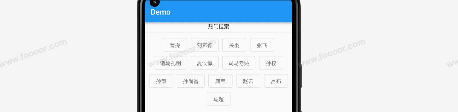
还可以使用 alignment 子组件的对齐方式,例如设置居中对齐:
dart
Wrap(
  alignment: WrapAlignment.center,  // 控制子组件的对齐方式
  spacing: 10,        // 子组件之间的间距
  runSpacing: 0,      // 行之间的间距
  children: [
    // ...
  ],
)
显示效果:
使用 direction 可以控制流式布局的主轴方向,上面使用的是水平方向,还可以是垂直方向。还可以使用 textDirection 控制按钮的排列顺序,上面按钮是从左到右排列,也可以从右到左排列(曹操排到最右边,从右边开始排列),和水平靠右对齐是不一样的。用的比较少,就不一一介绍了。