# CSS3教程 - 9 定位1
什么是定位?
定位是一种更高级的布局方式,通过定位可以很方便的将元素放到页面的任意位置。
比如说如果要实现下面的布局:
使用浮动或 margin 也可以实现,但是实现起来比较麻烦,另外使用浮动或 margin 很可能对其他元素的布局产生影响,而使用定位的话就很方便了。
下面来学习如何使用定位。
# 9.1 定位简介
定位使用的核心属性是 position,它定义了元素的定位类型。常见的定位类型有:
static(默认值)relativeabsolutefixedsticky
当 position 属性设置为除了 static 之外的值,则表示开启定位,开启定位后,我们可以使用其他的一些属性来对元素进行布局。下面就依次介绍各种定位方式。
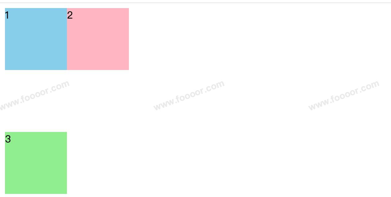
首先我们有下面这样的代码:
<!DOCTYPE html>
<html>
  <head>
    <style>
      .box1 {
        width: 100px;
        height: 100px;
        background-color: skyblue;
      }

      .box2 {
        width: 100px;
        height: 100px;
        background-color: lightpink;
      }

      .box3 {
        width: 100px;
        height: 100px;
        background-color: lightgreen;
      }
    </style>
  </head>

  <body>
    <div class="box1">1</div>
    <div class="box2">2</div>
    <div class="box3">3</div>
  </body>
</html>
1
2
3
4
5
6
7
8
9
10
11
12
13
14
15
16
17
18
19
20
21
22
23
24
25
26
27
28
29
30
2
3
4
5
6
7
8
9
10
11
12
13
14
15
16
17
18
19
20
21
22
23
24
25
26
27
28
29
30
- 编写了三个 div ,设置了不同的背景颜色而已。
显示如下:
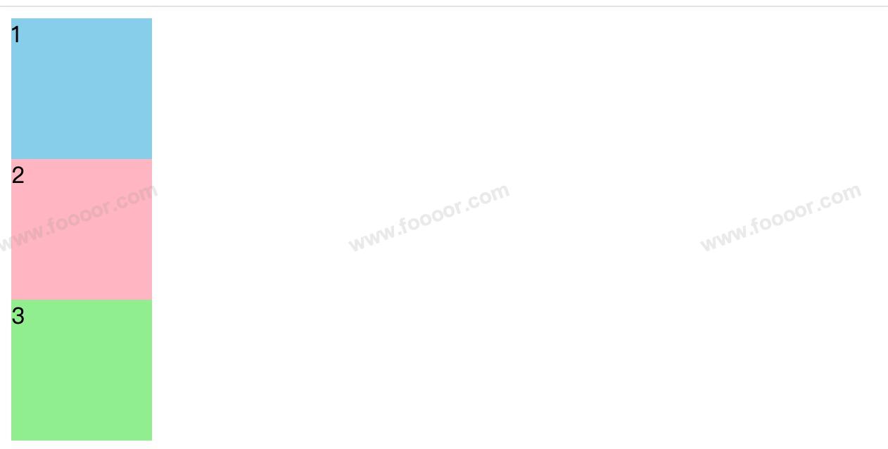
# 9.2 static默认定位
元素的 position 的默认值就是 static,所以设置了没有任何影响,元素按正常文档流排列。
生活没有任何波澜,过!
# 9.3 relative相对定位
当元素的 position 属性设置为 relative 时,表示开启相对定位。开启相对定位后,我们可以使用 top、right、bottom、left 四个属性设置元素的相对位置。设置元素相对于自己原来位置的偏移!
内容未完......
← 08-高度塌陷与BFC 09-定位2 →