# CSS3教程 - 15 弹性盒模型
前面学习了浮动、定位的方式来帮助我们布局,下面来学习 CSS3 中一个新的布局方式:弹性盒。浮动的定位方式有很多的副作用,而弹性盒可以替代浮动。
CSS 中的弹性盒(Flexbox)是一个非常强大且灵活的布局模型,可以提供更简单的方式来设计和排列页面元素,尤其是处理复杂的布局时。尤其是在移动端,每个手机的宽度都不同,通过弹性盒,可以使得子元素在父容器中能够按需自动分配空间并对齐,并使元素具有”弹性“,可以根据页面大小的改变而改变。
# 15.1 基本概念
弹性盒布局基于父容器和子元素的关系。父容器被称为 弹性容器(flex container),而容器中的每个直接子元素称为 弹性元素(弹性项)(flex item)。
我们首先需要给父容器设置 display: flex
或 display: inline-flex
属性,将父元素变为弹性容器,这样就能够启用弹性布局。
display: flex
:将父元素设置为块级弹性容器;display: inline-flex
:将父元素设置为行内弹性容器;
父元素设置为弹性容器,它的子元素(直接后代元素)就变成了弹性元素,弹性元素会变为块元素,即使是行内元素也会变成块元素。
display: inline-flex;
用的比较少,因为如果想让弹性容器和弹性容器之间像块元素一样横向排列,外面再套一个弹性容器就好了,一个元素可以同时是弹性容器和弹性元素。
举个栗子:
<!DOCTYPE html>
<html>
<head>
<style>
.outer {
width: 600px;
border: 5px solid red;
display: flex; /* 设置父元素为块级弹性容器 */
}
.outer div {
width: 100px;
height: 100px;
}
.box1 {
background-color: lightblue;
}
.box2 {
background-color: lightpink;
}
.box3 {
background-color: lightgreen;
}
</style>
</head>
<body>
<div class="outer">
<div class="box1">1</div>
<div class="box2">2</div>
<div class="box3">3</div>
</div>
</body>
</html>
2
3
4
5
6
7
8
9
10
11
12
13
14
15
16
17
18
19
20
21
22
23
24
25
26
27
28
29
30
31
32
33
34
35
36
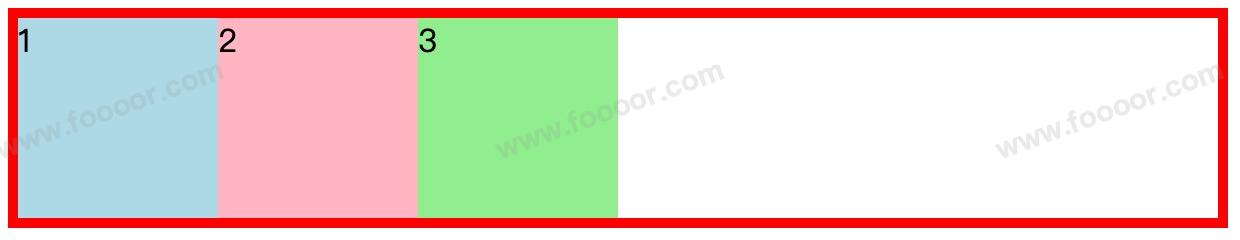
- 在上面的代码中,父容器中包含了三个子容器,然后通过
display: flex;
设置父容器为块级弹性容器。 - 子元素变为水平排列了。
显示如下:
# 15.2 弹性容器的属性
下面来介绍一下弹性容器相关的属性。
# 1 排列方式
上面设置了父元素为弹性容器后,子元素默认就变成了水平从左向右排列,通过 flex-direction
可以设置子元素的排列方式。
可选值有:
row
:默认值,弹性元素在容器中水平排列,自左向右;row-reverse
:弹性元素在容器中水平排列,自右向左;column
:弹性元素在容器中垂直排列,自上向下;column-reverse
:弹性元素在容器中垂直排列,自下向上;
举个栗子,给父元素弹性容器设置即可:
.outer {
width: 600px;
border: 5px solid red;
display: flex; /* 设置父元素为块级弹性容器 */
flex-direction: row; /* 设置子元素排列方式 */
}
2
3
4
5
6
7
各个值的显示效果如下:
flex-direction: row;
flex-direction: row-reverse:
flex-direction: column;
flex-direction: column-reverse;
可以看到排列非常的方便。
# 2 主轴与侧轴
在讲解后面的知识之前先讲解两个概念:主轴和侧轴。
主轴:弹性元素的排列方向称为主轴。
当
flex-direction: row;
时,主轴是水平方向,从左到右;当flex-direction: row-reverse;
时,主轴是水平方向,从右到左;当
flex-direction: column;
时,主轴是垂直方向,从上到下;当flex-direction: column-reverse;
时,主轴是垂直方向,从下到上;侧轴:与主轴垂直方向的称为侧轴,也叫辅轴或交叉轴。
当
flex-direction: row
(主轴是横向),则 侧轴是纵向(从上到下)。如果
flex-direction: column
(主轴是纵向),则 侧轴是横向(从左到右)。
也就是说主轴以及方向是由 flex-direction
属性决定。
# 3 主轴换行
当父元素在主轴上的尺寸不足以容纳子元素时,各个子元素会缩小主轴上的尺寸,以适应父容器在主轴上的尺寸。
举个栗子:
<!DOCTYPE html>
<html>
<head>
<style>
.outer {
width: 250px;
height: 50px;
border: 5px solid red;
display: flex; /* 设置父元素为块级弹性容器 */
flex-direction: row; /* 横向排列 */
}
.outer div {
width: 100px;
height: 100px;
}
.box1 {
background-color: lightblue;
}
.box2 {
background-color: lightpink;
}
.box3 {
background-color: lightgreen;
}
</style>
</head>
<body>
<div class="outer">
<div class="box1">1</div>
<div class="box2">2</div>
<div class="box3">3</div>
</div>
</body>
</html>
2
3
4
5
6
7
8
9
10
11
12
13
14
15
16
17
18
19
20
21
22
23
24
25
26
27
28
29
30
31
32
33
34
35
36
37
38
- 上面各个子元素的宽为100px,总共 300px,大于父元素的宽度为 250px,主轴为水平的,所以会缩小各个子元素的宽度;
- 各个子元素的高度是 100px,大于父元素的高度 50px,但是各个元素的高度不会缩小,而是从父元素中溢出;
显示如下:
可以设置弹性容器的 flex-wrap
属性,让子元素在弹性容器中自动换行。
flex-wrap
的可选值:
nowrap
:默认值,元素不会自动换行;wrap
:元素沿着侧轴方向自动换行;wrap-reverse
:元素沿着侧轴反方向换行,正常换行是从下一行开始,这个换行是从上一行重新开始;
举个栗子:
.outer {
width: 250px;
border: 5px solid red;
display: flex; /* 设置父元素为块级弹性容器 */
flex-direction: row; /* 横向排列 */
flex-wrap: wrap; /* 子元素换行 */
}
2
3
4
5
6
7
8
- 上面通过
flex-wrap: wrap;
设置了自动换行;
显示如下:
如果设置为 flex-wrap: wrap-reverse;
,则显示如下:
flex-wrap
和 flex-direction
有一个简写属性 flex-flow
:
/* 简写属性 */
flex-flow: row wrap;
2
了解一下。
# 4 主轴对齐方式
弹性容器的 justify-content
属性可以控制元素在主轴的对齐方式。
举个栗子:
<!DOCTYPE html>
<html>
<head>
<style>
.outer {
width: 600px;
border: 5px solid red;
/* 弹性容器 */
display: flex;
flex-direction: row;
justify-content: center; /* 设置在主轴的对齐方式 */
}
.outer div {
width: 100px;
height: 100px;
}
.box1 {
background-color: lightblue;
}
.box2 {
background-color: lightpink;
}
.box3 {
background-color: lightgreen;
}
</style>
</head>
<body>
<div class="outer">
<div class="box1">1</div>
<div class="box2">2</div>
<div class="box3">3</div>
</div>
</body>
</html>
2
3
4
5
6
7
8
9
10
11
12
13
14
15
16
17
18
19
20
21
22
23
24
25
26
27
28
29
30
31
32
33
34
35
36
37
38
39
40
- 上面设置了
justify-content: center;
也就是元素会在主轴上居中对齐。
显示如下:
justify-content
的可选值有:
flex-start
:默认值,子元素从起始位置开始排列,剩余的空白位置都在主轴的最后面;flex-end
:和flex-start
相反,子元素从容器的结束位置对齐,剩余的空白位置都在最前面。center
:子元素在容器中居中对齐,空白位置在两边。space-between
:子元素之间的空白间距相等,首尾没有间隔。space-around
:子元素之间的空白间距相等,首尾都有间隔,首尾间距是元素间距的一半。space-evenly
:子元素之间的间隔相等,首尾之间也有相等的间隔。
# 5 侧轴对齐方式
弹性容器的 align-items
属性可以控制子元素在侧轴上的对齐方式。
首先看一下默认效果:
<!DOCTYPE html>
<html>
<head>
<style>
.outer {
width: 600px;
height: 300px;
border: 5px solid red;
/* 弹性容器 */
display: flex;
flex-direction: row;
}
.outer div {
width: 100px;
}
.box1 {
background-color: lightblue;
}
.box2 {
background-color: lightpink;
}
.box3 {
background-color: lightgreen;
}
</style>
</head>
<body>
<div class="outer">
<div class="box1">1</div>
<div class="box2">2</div>
<div class="box3">3</div>
</div>
</body>
</html>
2
3
4
5
6
7
8
9
10
11
12
13
14
15
16
17
18
19
20
21
22
23
24
25
26
27
28
29
30
31
32
33
34
35
36
37
38
39
- 上面没有设置什么效果,设置了父元素为弹性盒而已。
- 另外去掉了子元素的高度,此时元素在侧轴上的尺寸是撑满父容器的。
显示如下:
我们可以通过弹性容器的 align-items
属性,设置子元素在侧轴上的对齐方式。
举个例子:
.outer {
width: 600px;
height: 300px;
border: 5px solid red;
/* 弹性容器 */
display: flex;
flex-direction: row;
align-items: stretch; /* 元素在侧轴上的对齐方式 */
}
2
3
4
5
6
7
8
9
10
align-items
的默认值就是stretch
,所以设置完没有效果,就是将子元素在侧轴方向上拉伸填满容器。
其他的取值及效果如下:
flex-start
:子元素在侧轴起始位置对齐:flex-end
:子元素在侧轴结束位置对齐,此时侧轴从上到下,结束位置在下,所以元素在底部:center
:子元素在侧轴方向上居中对齐:baseline
:基线对齐,用的比较少:
# 6 水平垂直居中
通过上面主轴和侧轴的对齐方式,如果让子元素水平和垂直居中就非常简单了。
直接代码如下:
<!DOCTYPE html>
<html>
<head>
<style>
.outer {
width: 600px;
height: 200px;
border: 5px solid red;
/* 弹性容器 */
display: flex;
flex-direction: row;
justify-content: center; /* 主轴居中 */
align-items: center; /* 侧轴居中 */
}
.box1 {
background-color: lightblue;
}
</style>
</head>
<body>
<div class="outer">
<div class="box1">www.foooor.com</div>
</div>
</body>
</html>
2
3
4
5
6
7
8
9
10
11
12
13
14
15
16
17
18
19
20
21
22
23
24
25
26
27
28
29
30
- 直接主轴居中、侧轴居中即可。
显示如下:
# 7 侧轴多行对齐方式
弹性容器的 align-content
可以控制多行项目在侧轴方向上的对齐方式,只有在 flex-wrap: wrap;
被启用并且容器中有多行内容时,align-content
才会有效。
先看一下默认效果:
<!DOCTYPE html>
<html>
<head>
<style>
.outer {
width: 600px;
height: 200px;
border: 5px solid red;
/* 弹性容器 */
display: flex;
flex-direction: row;
flex-wrap: wrap; /* 设置主轴自动换行 */
align-content: stretch; /* 多行元素在侧轴上的对齐方式 */
}
.outer div {
width: 200px;
}
.box1 {
background-color: lightblue;
}
.box2 {
background-color: lightpink;
}
.box3 {
background-color: lightgreen;
}
</style>
</head>
<body>
<div class="outer">
<div class="box1">1</div>
<div class="box2">2</div>
<div class="box3">3</div>
<div class="box2">4</div>
<div class="box3">5</div>
<div class="box1">6</div>
<div class="box1">7</div>
<div class="box2">8</div>
</div>
</body>
</html>
2
3
4
5
6
7
8
9
10
11
12
13
14
15
16
17
18
19
20
21
22
23
24
25
26
27
28
29
30
31
32
33
34
35
36
37
38
39
40
41
42
43
44
45
- 上面设置了主轴自动换行,并设置了
align-content: stretch;
表示每一行会尽量拉伸填满容器。其实是默认值,设置不设置效果是一样的。
显示如下:
align-content
的可选值及效果如下:
stretch
:行的高度会被拉伸,填满容器。效果如上。
flex-start
:行对齐容器的顶部,可能会有多余的空间分布在底部:flex-end
:行对齐容器的底部,可能会有多余的空间分布在顶部:center
:行会在容器中居中:space-between
:行之间的间隔相等。space-around
:行之间的间隔相等,首尾有间隔,行间距是首尾间距的两倍:space-evenly
:行之间的间隔相等,首尾有间隔,行间距等于首尾间距:
align-content
与 align-items
的区别
align-items
:用于控制 单行 项目在交叉轴方向上的对齐方式。align-content
:用于控制 多行 项目在交叉轴方向上的对齐方式。
# 15.3 弹性元素的属性
下面来介绍弹性元素相关的属性。
# 1 align-self
align-self
属性允许我们单独控制某个 弹性元素 在交叉轴(侧轴)方向上的对齐方式。它会覆盖弹性容器的 align-items
设置,为特定的子项目提供独立的对齐方式。
align-self
的可选值如下:
auto
:默认值,该元素采用父容器的align-items
设置值;stretch
:该元素将被拉伸以填满容器的交叉轴方向;flex-start
:该元素将对齐到容器的侧轴起点;flex-end
:该元素将对齐到容器的侧轴终点;center
:该元素将会在侧轴方向上居中对齐;baseline
:该元素将对齐到容器中项目的基线。
举个栗子:
<!DOCTYPE html>
<html>
<head>
<style>
.outer {
width: 600px;
height: 200px;
border: 5px solid red;
/* 弹性容器 */
display: flex;
align-items: center; /* 子元素在侧轴居中对齐 */
}
.outer div {
width: 100px;
}
.box1 {
align-self: flex-start; /* 单独指定对齐方式 */
background-color: lightblue;
}
.box2 {
background-color: lightpink;
}
.box3 {
background-color: lightgreen;
}
</style>
</head>
<body>
<div class="outer">
<div class="box1">1</div>
<div class="box2">2</div>
<div class="box3">3</div>
</div>
</body>
</html>
2
3
4
5
6
7
8
9
10
11
12
13
14
15
16
17
18
19
20
21
22
23
24
25
26
27
28
29
30
31
32
33
34
35
36
37
38
39
- 在上面的代码中,设置了弹性容器中元素在侧轴的对齐方式为居中对齐。
- 但是单独设置了 box1 在侧轴的对齐方式为侧轴的起点。
显示如下:
其他的对齐方式就不演示了,参考 align-items
的对齐方式即可,只是针对单个元素设置而已。
# 2 伸展系数
弹性盒模型,可以让元素可以具有弹性,flex-grow
可以指定弹性元素的伸展系数,当父元素有多余的空间时,可以指定子元素如何伸展,默认值为 0,也就是不伸展。
通过 flex-grow
可以为各个子元素指定对父元素剩余空间的分配。
举个栗子:
<!DOCTYPE html>
<html>
<head>
<style>
.outer {
width: 600px;
border: 5px solid red;
display: flex; /* 设置父元素为块级弹性容器 */
}
.outer div {
width: 100px;
height: 100px;
}
.box1 {
background-color: lightblue;
flex-grow: 1; /* 指定伸展系数 */
}
.box2 {
background-color: lightpink;
flex-grow: 2; /* 指定伸展系数 */
}
.box3 {
background-color: lightgreen;
flex-grow: 3; /* 指定伸展系数 */
}
</style>
</head>
<body>
<div class="outer">
<div class="box1">1</div>
<div class="box2">2</div>
<div class="box3">3</div>
</div>
</body>
</html>
2
3
4
5
6
7
8
9
10
11
12
13
14
15
16
17
18
19
20
21
22
23
24
25
26
27
28
29
30
31
32
33
34
35
36
37
38
39
- 上面父元素宽度为600px,每个元素为100px,还剩余300px;那么就由三个元素分配剩余的 300px。
- box1 的
flex-grow: 1;
,则剩余的 300px 占用1份,box3 的flex-grow: 3;
则占用三份;值越大,伸展的越大。
显示如下:
# 3 缩减系数
flex-shrink
属性用于指定弹性元素的收缩系数。当父元素中的空间不足以容纳所有的子元素时,如何对子元素进行收缩。默认值为 1,各个元素都同比例收缩。如果设置为 0,那么就不会收缩,子元素会从父元素溢出。
举个栗子:
<!DOCTYPE html>
<html>
<head>
<style>
.outer {
width: 300px;
border: 5px solid red;
display: flex; /* 设置父元素为块级弹性容器 */
}
.outer div {
width: 200px;
height: 200px;
}
.box1 {
background-color: lightblue;
flex-shrink: 1; /* 指定收缩系数 */
}
.box2 {
background-color: lightpink;
flex-shrink: 2; /* 指定收缩系数 */
}
.box3 {
background-color: lightgreen;
flex-shrink: 3; /* 指定收缩系数 */
}
</style>
</head>
<body>
<div class="outer">
<div class="box1">1</div>
<div class="box2">2</div>
<div class="box3">3</div>
</div>
</body>
</html>
2
3
4
5
6
7
8
9
10
11
12
13
14
15
16
17
18
19
20
21
22
23
24
25
26
27
28
29
30
31
32
33
34
35
36
37
38
39
- 上面指定了每个子元素的宽度是 200px,共600px,父元素总共才300px,所以父元素无法容纳子元素,会对子元素进行收缩。
- 指定了 box1 为
flex-shrink: 1;
收缩最小,box3 为flex-shrink: 3;
收缩最大。
显示如下:
# 4 基础长度
flex-basis
指定的是元素在主轴上的基础长度,如果主轴是横向的,则指定的是元素的宽度;如果主轴是垂直的,则指定的是元素的高度。默认值是 auto
,表示参考元素自身的高度或宽度。
如果传递了一个具体的数值,则 flex-basis
会覆盖元素在主轴上的尺寸,也就是会覆盖宽度或高度。一般用的比较少,都设置为 auto
。
举个栗子:
<!DOCTYPE html>
<html>
<head>
<style>
.outer {
width: 600px;
height: 200px;
border: 5px solid red;
/* 弹性容器 */
display: flex;
}
.outer div {
width: 100px;
height: 100px;
}
.box1 {
flex-basis: 200px; /* 基础长度 */
background-color: lightblue;
}
.box2 {
background-color: lightpink;
}
.box3 {
background-color: lightgreen;
}
</style>
</head>
<body>
<div class="outer">
<div class="box1">1</div>
<div class="box2">2</div>
<div class="box3">3</div>
</div>
</body>
</html>
2
3
4
5
6
7
8
9
10
11
12
13
14
15
16
17
18
19
20
21
22
23
24
25
26
27
28
29
30
31
32
33
34
35
36
37
38
39
- 上面针对 box1 设置了基础长度,主轴为横向,那么会覆盖元素的宽度。
显示如下:
# 5 复合属性
flex-grow
、flex-shrink
、flex-basis
三个属性一般很少单独使用,而是使用 flex
复合属性来设置这三个属性。
flex
可以设置弹性元素三个样式,语法:
flex: 增长系数 缩减系数 基础长度
flex
属性除了可以像上面设置三个值,还可以设置三个可选值:
initial
:相当于flex: 0 1 auto;
默认值,不会放大,会自动缩小;auto
:相当于flex: 1 1 auto;
元素自动放大缩小;none
:相当于flex: 0 0 auto;
弹性元素没有弹性。
# 6 排列顺序
order
属性可以控制弹性元素的排列顺序。order
属性是一个 整数 值,用于指定弹性项目的显示顺序。数字越小,项目越先显示,负值也有效。如果多个项目有相同的 order
值,它们将按照它们在 HTML 中的顺序进行排列。
举个栗子:
<!DOCTYPE html>
<html>
<head>
<style>
.outer {
width: 600px;
height: 200px;
border: 5px solid red;
/* 弹性容器 */
display: flex;
}
.outer div {
width: 100px;
height: 100px;
}
.box1 {
order: 2; /* 设置显示顺序 */
background-color: lightblue;
}
.box2 {
order: 0; /* 设置显示顺序 */
background-color: lightpink;
}
.box3 {
order: 1; /* 设置显示顺序 */
background-color: lightgreen;
}
</style>
</head>
<body>
<div class="outer">
<div class="box1">1</div>
<div class="box2">2</div>
<div class="box3">3</div>
</div>
</body>
</html>
2
3
4
5
6
7
8
9
10
11
12
13
14
15
16
17
18
19
20
21
22
23
24
25
26
27
28
29
30
31
32
33
34
35
36
37
38
39
40
41
- 上面三个弹性元素,默认排序是 1、2、3,但是通过 order 属性,调整了显示顺序为 2、3、1。
显示如下:
# 15.4 菜单练习
下面使用弹性盒来实现浮动时候实现的菜单:
思路:
- 直接将
<ul>
设置为弹性容器,<li>
就变成弹性元素了; - 使用
flex: auto;
将弹性元素设置为自动伸缩,这个时候布局就差不多了; - 然后设置行高和居中,微调样式即可。
完整代码如下:
<!DOCTYPE html>
<html>
<head>
<style>
* { /* 重置样式 */
padding: 0;
margin: 0;
/* 去掉li元素前面的黑点 */
list-style: none;
}
.nav {
width: 1190px;
height: 48px;
background-color: #e8e7e3;
margin: 50px auto; /* 设置导航条居中 */
/* 弹性盒容器 */
display: flex;
}
.nav li {
flex: auto; /* 弹性元素自动缩放 */
line-height: 48px; /* 设置行高 */
text-align: center; /* 文字水平居中 */
}
.nav a {
display: block; /** 设置为块元素,行高会继承自父元素,也就是li **/
font-size: 18px;
color: #777777;
text-decoration: none; /* 去除下划线 */
}
/* 超链接悬浮效果 */
.nav li a:hover {
background-color: #3f3f3f;
color: #e8e7e3;
}
</style>
</head>
<body>
<ul class="nav">
<li><a href="#">HTML/CSS</a></li>
<li><a href="#">Browser Side</a></li>
<li><a href="#">Server Side</a></li>
<li><a href="#">Programming</a></li>
<li><a href="#">XML</a></li>
<li><a href="#">Web Building</a></li>
<li><a href="#">Reference</a></li>
</ul>
</body>
</html>
2
3
4
5
6
7
8
9
10
11
12
13
14
15
16
17
18
19
20
21
22
23
24
25
26
27
28
29
30
31
32
33
34
35
36
37
38
39
40
41
42
43
44
45
46
47
48
49
50
51
52
53
54
可以看到弹性盒布局非常的方便。