# CSS3教程 - 9 定位2
继续讲解定位...
# 9.7 水平布局
我们之前在盒子模型的章节讲过,水平方向的布局存在如下等式:
margin-left + border-left + padding-left + width + padding-right + border-right + margin-right = 其父元素的宽度
当使用绝对定位时,需要添加 left 和 right 两个值(此时规则和之前一样,只是多添加了两个值)
left + margin-left + border-left + padding-left + width + padding-right + border-right + margin-right + right = 其包含块内容区的宽度
当发生过度约束时(就是等式不成立的时候):
- 如果 9 个值中没有
auto,则自动调整right值以使等式成立(之前 7 个值的时候调整的是margin-right) - 如果 9 个值中有
auto,则自动调整auto的值以使等式成立
可设置auto的值:margin-left、margin-right、width、left、right 。
因为left和right的值默认是auto,所以如果没有设置left和right,当等式不满足时,则会自动调整这两个值。
所以一个元素开启了绝对定位,又想让它在父元素中居中,则需要设置为如下:
<!DOCTYPE html>
<html>
  <head>
    <link rel="stylesheet" href="style/reset.css" />
    <style>
      .box1 {
        width: 300px;
        height: 300px;
        background-color: lightskyblue;
        position: relative;  /* 父相对定位 */
      }

      .box2 {
        width: 100px;
        height: 100px;
        background-color: lightpink;
        position: absolute;  /* 子绝对定位 */
        margin-left: auto;
        margin-right: auto;
        left: 0px;
        right: 0px;
      }
    </style>
  </head>

  <body>
    <div class="box1">
      <div class="box2"></div>
    </div>
  </body>
</html>
2
3
4
5
6
7
8
9
10
11
12
13
14
15
16
17
18
19
20
21
22
23
24
25
26
27
28
29
30
31
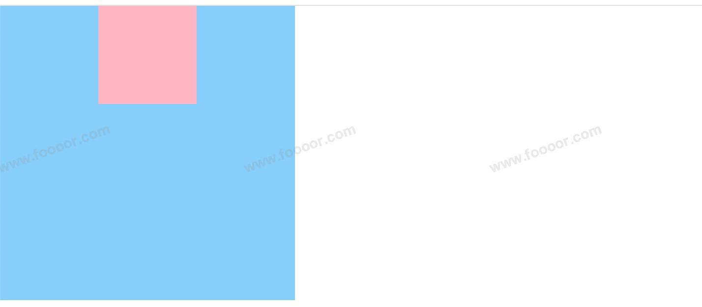
- 首先父元素开启相对定位,子元素开启绝对定位;
- 子元素设置
margin-left和margin-right为auto,left和right为0px;这样左右的距离会被margin-left和margin-right平分,从而让元素居中。
显示效果:
设置 margin-left 和 margin-right 为 0px,left 和 right 为 auto 可以让元素居中吗?
不可以,此时等式不成立,会自动调整 right 使等式成立,左移此时 box1 居左。
# 9.8 垂直布局
元素开启决定定位后,垂直方向布局的等式的也必须要满足:
top + margin-top + border-top + padding-top + height + padding-bottom + border-bottom + margin-bottom + top = 其包含块内容区的高度
通过这个等式,可以让元组在父元素中垂直居中。